Google seems to be on a roll for Google App updates this year. If you were trying to settle yourself with the previous update then wait, there is something you might not like. Google is further making changes in the layout and design of the application.
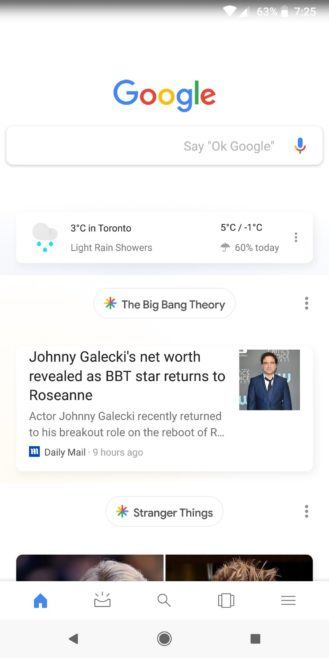
The Google app switched to the bottom 5 tabs for different uses, a completely new feed look, and the up-swipeable cards. However, the company now seems to get over with this layout soon and switch yet again to an all the more newer look. There is a change in the layout, design of the feed, which honestly is nothing the users were waiting for. Moreover, the latest updates might shock them.

The days of easy, clean and neatly aligned with the news and topics, seems to be a history now. Google app will now have a huge bubble with the topic name and below the users will be offered with the news. Indeed the feed would be very easy on the eyes but will use a lot of space on the feed.
The previous updates showed a customized layout and had an option for the user to remove the story by clicking on the “not interested” button, which might change and also not be swipeable.
One of the significant features will be that whether you view it from the app or any third-party launcher, the feed layout will be the same. The difference will be that Google app will feature the 5 bottom tabs instead of “upcoming” icon in the top right.
Indeed the company is trying to add-on features, which might be terrible in the layout and design, however, it can be expected from Google that their will be changes made in the future and more user-friendly application.

Leave a Reply